Branding
Creative Lead: Melody Yung

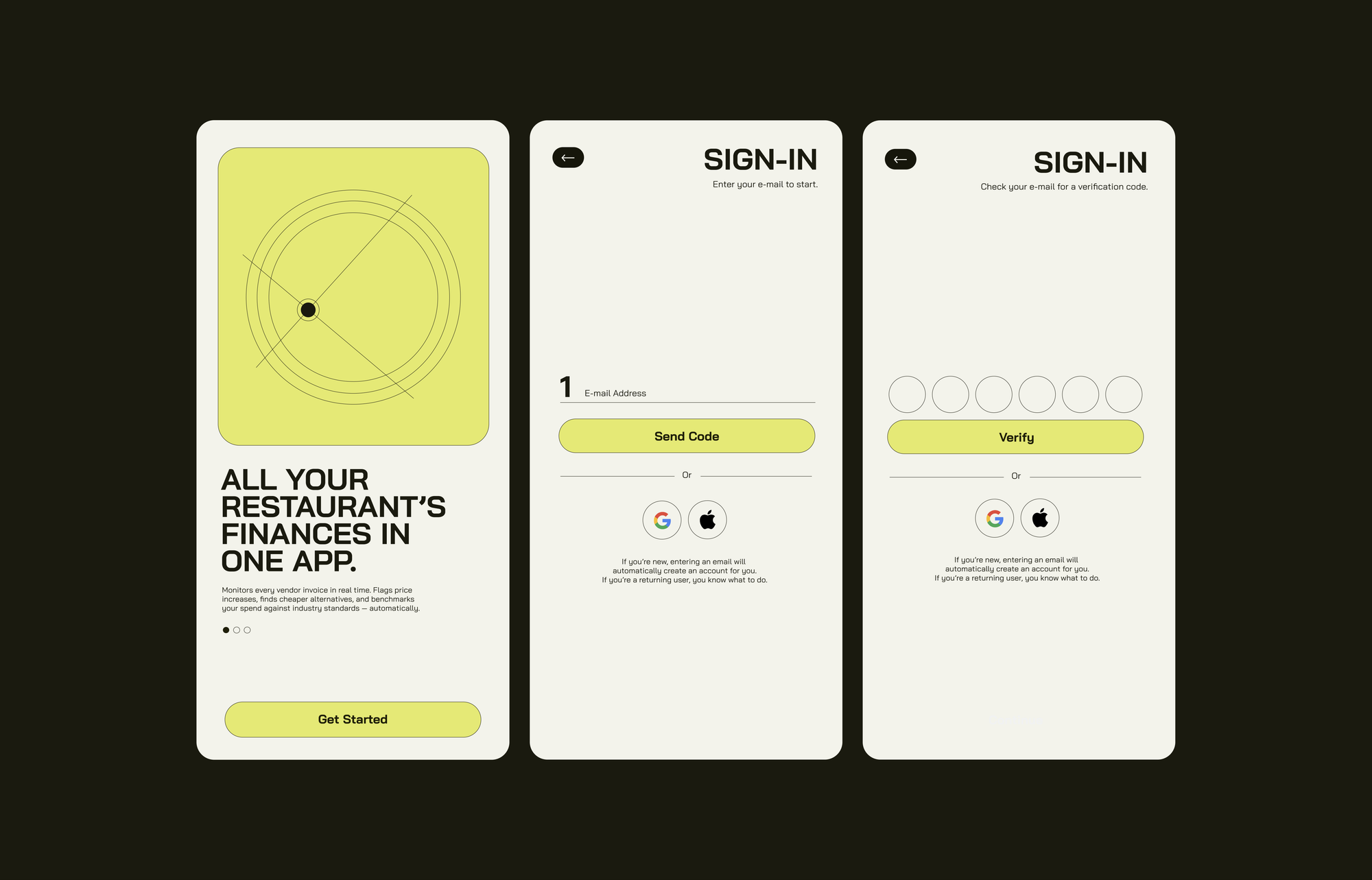
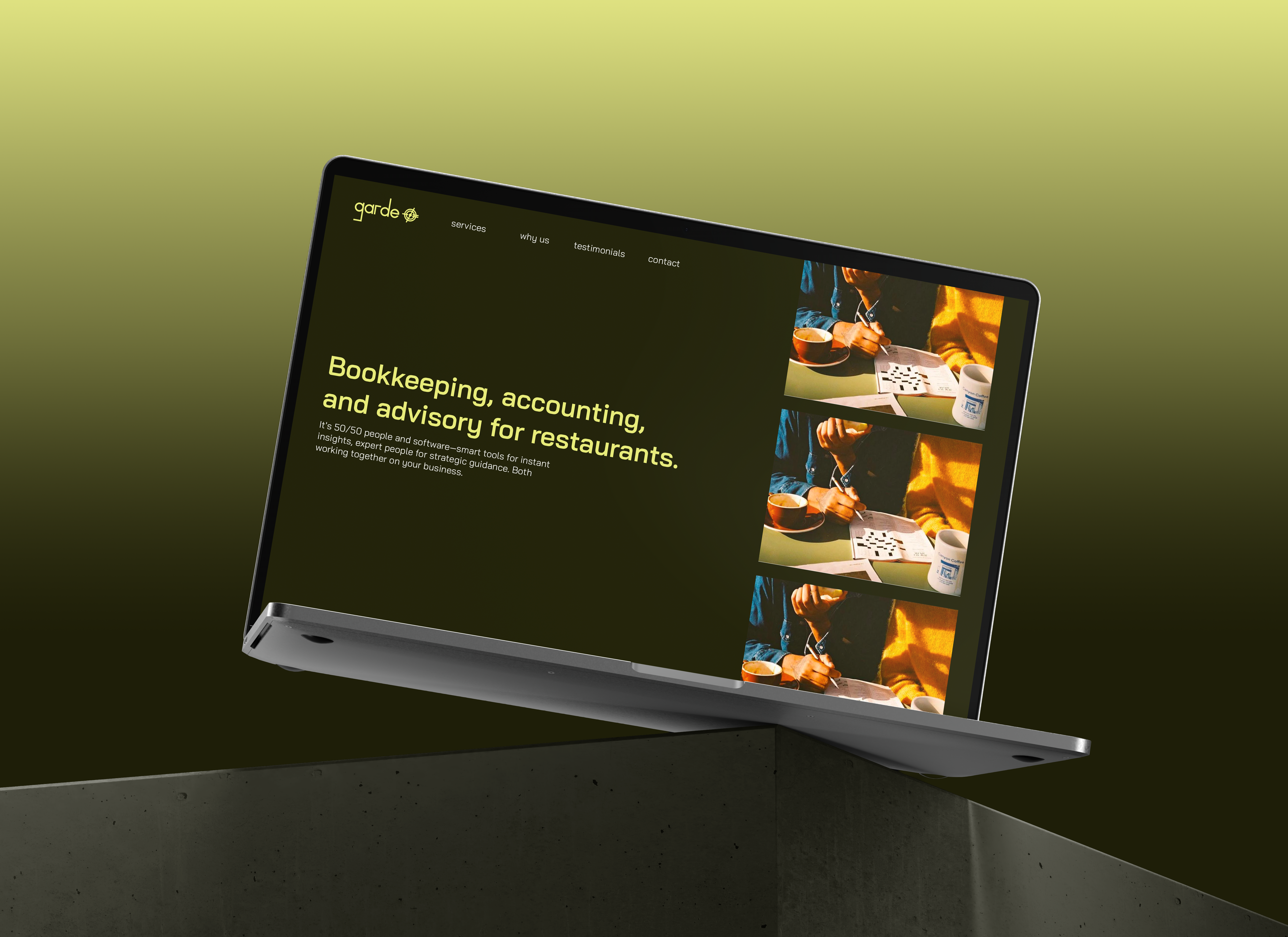
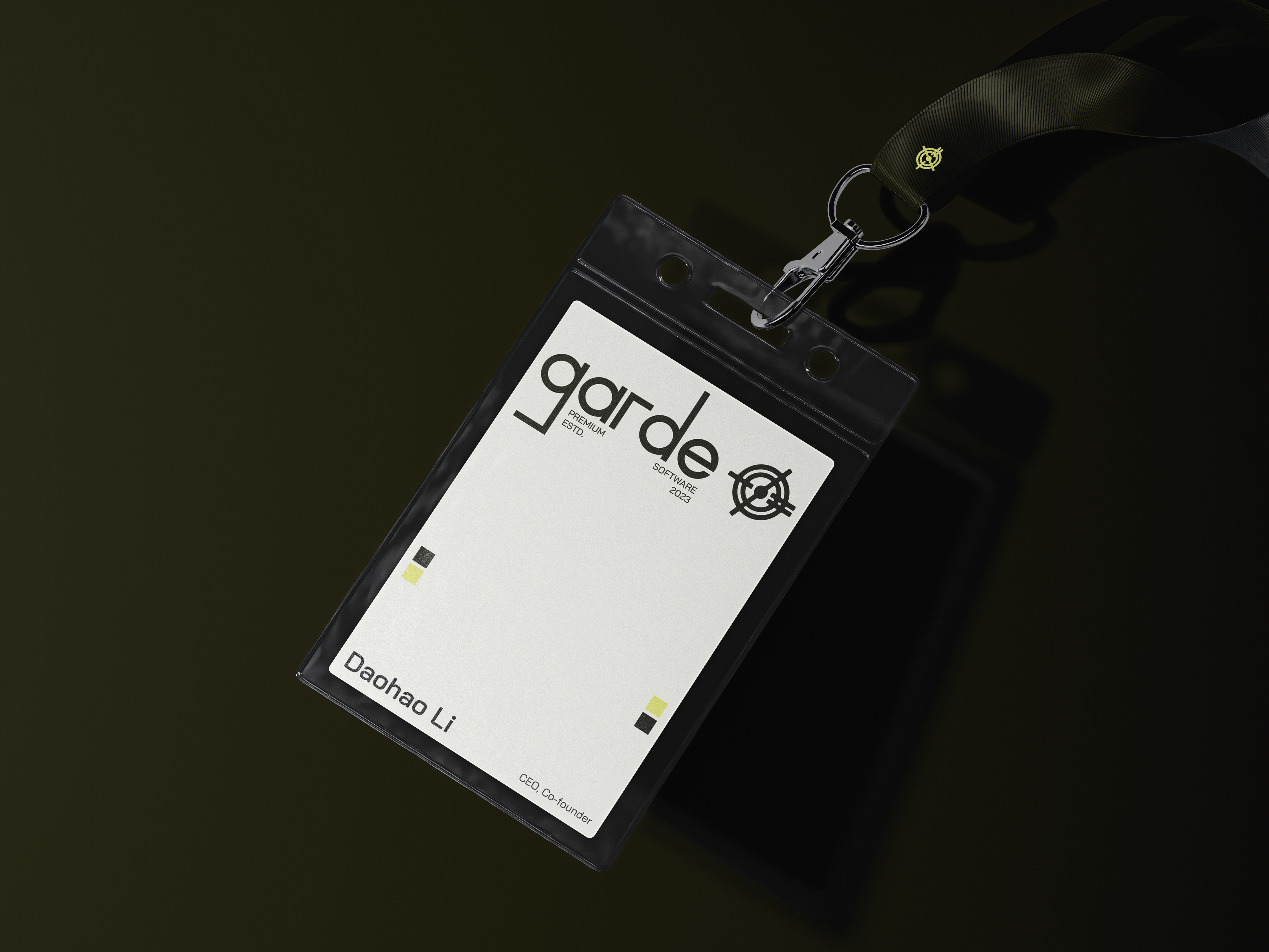
The custom type uses sharp ninety-degree angles and perfect rounds to give the logomark a technical and scientific feeling, not straying too far from their company’s software foundations. However, since the target audience is restaurant owners, we avoided typical signifiers of technology—clean whites, monotype, and a cool-to-the-touch feeling.
The resulting design lives somewhere in-between: sleek enough to be tech, different enough to represent culture.